Motivation
Three years ago, a GitHub issue was opened to support input accessory view from React Native.
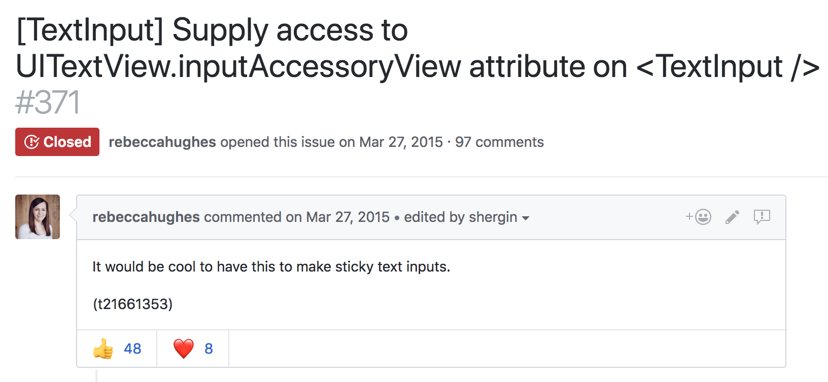
In the ensuing years, there have been countless '+1s', various workarounds, and zero concrete changes to RN on this issue - until today. Starting with iOS, we're exposing an API for accessing the native input accessory view and we are excited to share how we built it.
Background
What exactly is an input accessory view? Reading Apple's developer documentation, we learn that it's a custom view which can be anchored to the top of the system keyboard whenever a receiver becomes the first responder. Anything that inherits from UIResponder can redeclare the .inputAccessoryView property as read-write, and manage a custom view here. The responder infrastructure mounts the view, and keeps it in sync with the system keyboard. Gestures which dismiss the keyboard, like a drag or tap, are applied to the input accessory view at the framework level. This allows us to build content with interactive keyboard dismissal, an integral feature in top-tier messaging apps like iMessage and WhatsApp.
There are two common use cases for anchoring a view to the top of the keyboard. The first is creating a keyboard toolbar, like the Facebook composer background picker.
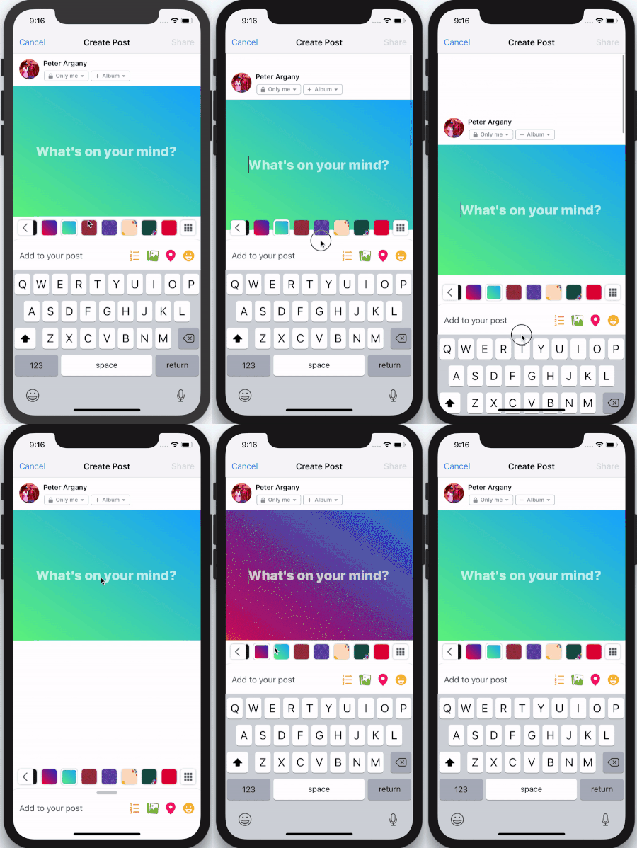
In this scenario, the keyboard is focused on a text input field, and the input accessory view is used to provide additional keyboard functionality. This functionality is contextual to the type of input field. In a mapping application it could be address suggestions, or in a text editor, it could be rich text formatting tools.
The Objective-C UIResponder who owns the <InputAccessoryView> in this scenario should be clear. The <TextInput> has become first responder, and under the hood this becomes an instance of UITextView or UITextField.
The second common scenario is sticky text inputs:
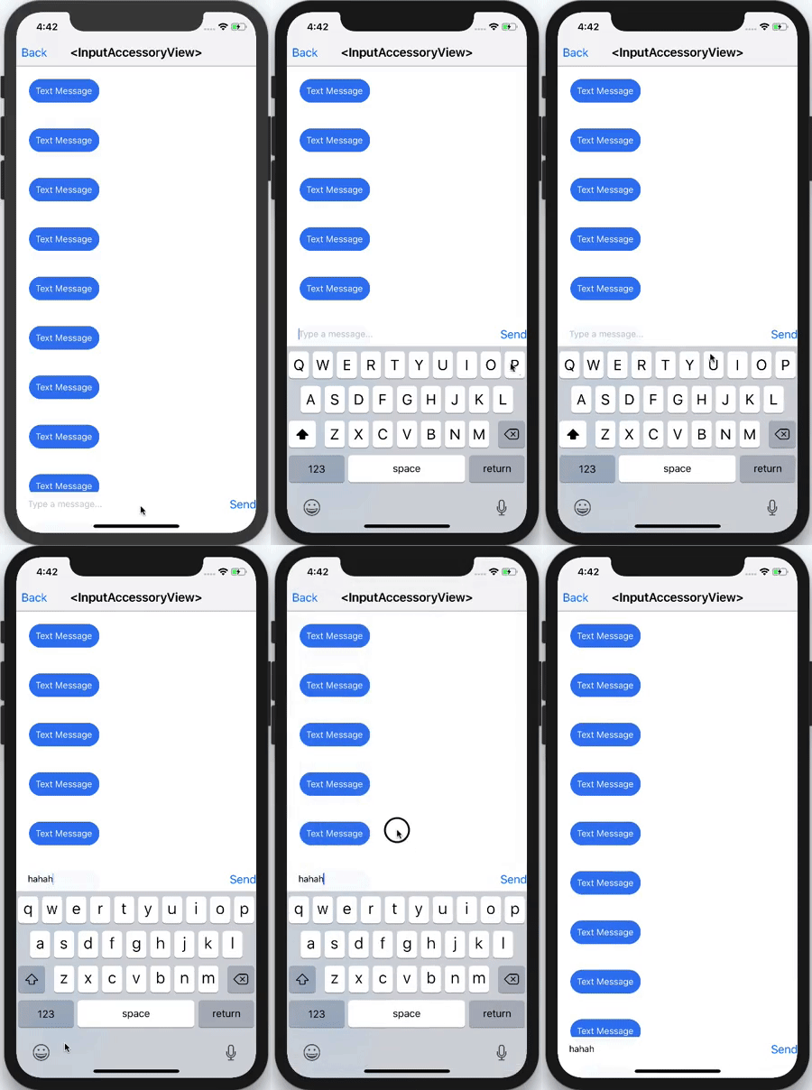
Here, the text input is actually part of the input accessory view itself. This is commonly used in messaging applications, where a message can be composed while scrolling through a thread of previous messages.
Who owns the <InputAccessoryView> in this example? Can it be the UITextView or UITextField again? The text input is inside the input accessory view, this sounds like a circular dependency. Solving this issue alone is another blog post in itself. Spoilers: the owner is a generic UIView subclass who we manually tell to becomeFirstResponder.
API Design
We now know what an <InputAccessoryView> is, and how we want to use it. The next step is designing an API that makes sense for both use cases, and works well with existing React Native components like <TextInput>.
For keyboard toolbars, there are a few things we want to consider:
- We want to be able to hoist any generic React Native view hierarchy into the
<InputAccessoryView>. - We want this generic and detached view hierarchy to accept touches and be able to manipulate application state.
- We want to link an
<InputAccessoryView>to a particular<TextInput>. - We want to be able to share an
<InputAccessoryView>across multiple text inputs, without duplicating any code.
We can achieve #1 using a concept similar to React portals. In this design, we portal React Native views to a UIView hierarchy managed by the responder infrastructure. Since React Native views render as UIViews, this is actually quite straightforward - we can just override:
- (void)insertReactSubview:(UIView *)subview atIndex:(NSInteger)atIndex
and pipe all the subviews to a new UIView hierarchy. For #2, we set up a new RCTTouchHandler for the <InputAccessoryView>. State updates are achieved by using regular event callbacks. For #3 and #4, we use the nativeID field to locate the accessory view UIView hierarchy in native code during the creation of a <TextInput> component. This function uses the .inputAccessoryView property of the underlying native text input. Doing this effectively links <InputAccessoryView> to <TextInput> in their ObjC implementations.
Supporting sticky text inputs (scenario 2) adds a few more constraints. For this design, the input accessory view has a text input as a child, so linking via nativeID is not an option. Instead, we set the .inputAccessoryView of a generic off-screen UIView to our native <InputAccessoryView> hierarchy. By manually telling this generic UIView to become first responder, the hierarchy is mounted by responder infrastructure. This concept is explained thoroughly in the aforementioned blog post.
Pitfalls
Of course not everything was smooth sailing while building this API. Here are a few pitfalls we encountered, along with how we fixed them.
An initial idea for building this API involved listening to NSNotificationCenter for UIKeyboardWill(Show/Hide/ChangeFrame) events. This pattern is used in some open-sourced libraries, and internally in some parts of the Facebook app. Unfortunately, UIKeyboardDidChangeFrame events were not being called in time to update the <InputAccessoryView> frame on swipes. Also, changes in keyboard height are not captured by these events. This creates a class of bugs that manifest like this:
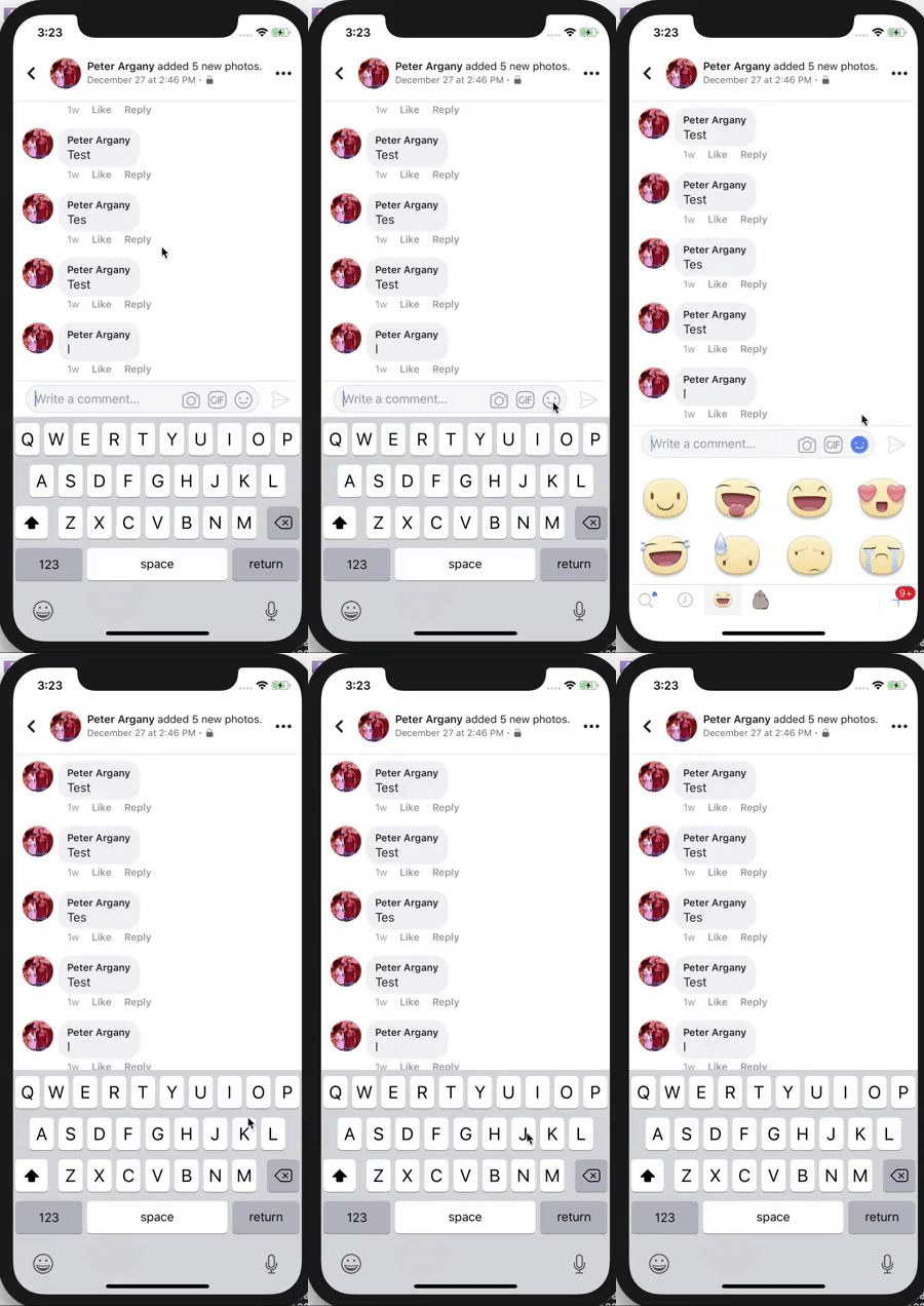
On iPhone X, text and emoji keyboard are different heights. Most applications using keyboard events to manipulate text input frames had to fix the above bug. Our solution was to commit to using the .inputAccessoryView property, which meant that the responder infrastructure handles frame updates like this.
Another tricky bug we encountered was avoiding the home pill on iPhone X. You may be thinking, “Apple developed safeAreaLayoutGuide for this very reason, this is trivial!”. We were just as naive. The first issue is that the native <InputAccessoryView> implementation has no window to anchor to until the moment it is about to appear. That's alright, we can override -(BOOL)becomeFirstResponder and enforce layout constraints there. Adhering to these constraints bumps the accessory view up, but another bug arises: 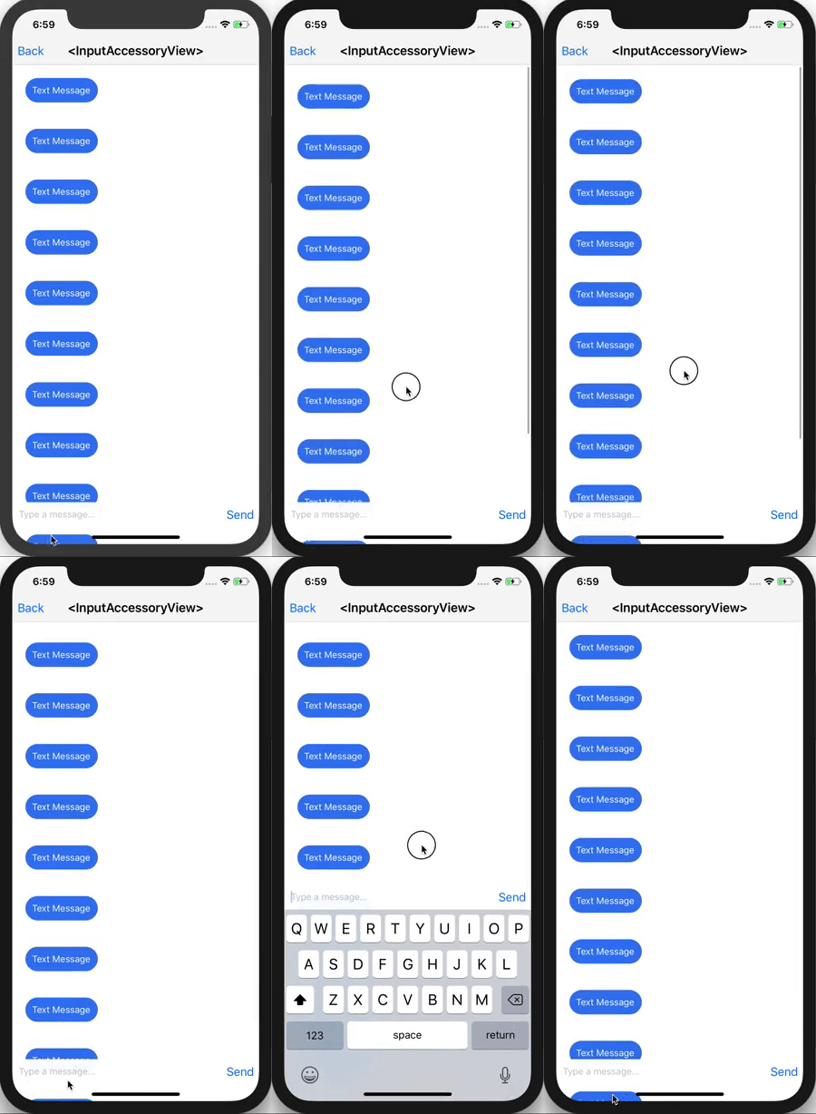
The input accessory view successfully avoids the home pill, but now content behind the unsafe area is visible. The solution lies in this radar. I wrapped the native <InputAccessoryView> hierarchy in a container which doesn't conform to the safeAreaLayoutGuide constraints. The native container covers the content in the unsafe area, while the <InputAccessoryView> stays within the safe area boundaries.
Example Usage
Here's an example which builds a keyboard toolbar button to reset <TextInput> state.
class TextInputAccessoryViewExample extends React.Component<
  {},
  *
> {
  constructor(props) {
    super(props);
    this.state = { text: 'Placeholder Text' };
  }

  render() {
    const inputAccessoryViewID = 'inputAccessoryView1';
    return (
      <View>
        <TextInput
          style={styles.default}
          inputAccessoryViewID={inputAccessoryViewID}
          onChangeText={(text) => this.setState({ text })}
          value={this.state.text}
        />
        <InputAccessoryView nativeID={inputAccessoryViewID}>
          <View style={{ backgroundColor: 'white' }}>
            <Button
              onPress={() =>
                this.setState({ text: 'Placeholder Text' })
              }
              title="Reset Text"
            />
          </View>
        </InputAccessoryView>
      </View>
    );
  }
}
Another example for Sticky Text Inputs can be found in the repository.
When will I be able to use this?
The full commit for this feature implementation is here. <InputAccessoryView> will be available in the upcoming v0.55.0 release.
Happy keyboarding :)